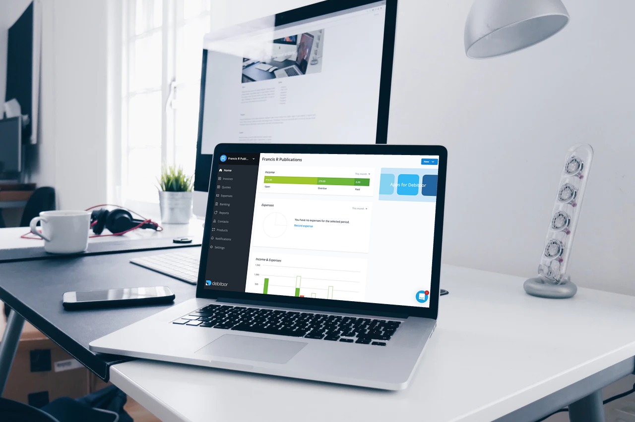
As part of our goal to continue to improve the software based on the feedback and needs of our users, we’re excited to share the latest update in the design of Debitoor: a new, dark background for the navigation menu bar.

This change does not affect how the menu works or any of the features available on your plan. It’s purely an aesthetic update that our designers have spent time researching and testing.
Let’s take a closer look at the change and how it ties in to some other updates you might have noticed over the last few months in your invoicing & accounting software.
From a design perspective
As a relatively small change that has a big visual impact on the software and working with your account, you might be wondering why the decision was made to move to a darker background for the navigation bar.
For answers, we turned to our UX Lead designer, Hugo Corzo. He shared some insights into how the new, dark background compares with the former light background.
First, the dark navigation bar creates a clear separation between the menu and the tab that you’re currently viewing. This helps to add focus to the page that you’re working on - whether you’re creating an invoice, adding an expense, or checking your payments. The former light navigation bar blended with the page you were viewing, offering no real delineation between the two.
Second, the visual impact of the dark navigation menu better allows you to see the current page as centred. Because there is a clearer separation between the two, it’s easier to see that the pages are centred, rather than seemingly off to the side of the navigation bar. The centred view makes whichever page you’re on in the app instantly more visually appealing.
Hugo adds that the above two reasons combined with the increased contrast both with the navigation text and the tabs in the software create better readability across the web app.
Continued updates to the look and feel of Debitoor
One of the other big reasons behind this update is our commitment to keep Debitoor modern, which inevitably means changes to different parts of the software. These changes might seem small but are based on ongoing research into usability, readability, aesthetic appeal, and also the latest in design trends for the industry.

This update is just the next in our recent steps to continue to update the software step-by-step. You might recall a few of the other changes we’ve made recently:
- A new look for the contacts & suppliers cards: we updated the tab to make adding a new customer or supplier easier to view, giving it a bit more organisation.
- Improved layout for reports: the balance sheet and P&L got a small redesign when it comes to the options for actions regarding these reports.
- Moving the navigation bar to the left: this move improved the use of screen space across devices, giving you a better view of your invoicing & accounting.
- Slight background colour change: so subtle you might not have noticed that the background went from white to a slight grey.
These changes all contribute to our moving towards a more modern look without totally disrupting how you work with the software. None of the changes mentioned affect any of the features you’ve come to love in your Debitoor account.
