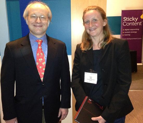
When I recently joined the Nielsen Norman Group Usability Week in London, I had the pleasure of sitting in on the highly esteemed usability guru Jakob Nielsen's Keynote Speech with the promising title: 'Making Usability Happen'.
His session covered nothing less than the development of web usability over the past last 20 years. From the first, simple websites accessed on rare, heavy and expensive 'computer work stations' in the mid 90s, over texting, messaging and laptop use in the early years of 2000 to the gigantic multi-platform approach of today's web usability.
And that's when I realised that I belong to the typical group which Jakob Nielsen referred to as 'iPad potatos'. The kind of audience who'll slouch into a comfortable position with their iPads, preferring everything the easy way around.
And a super important user group for anyone dealing with the art of creating content for multi-device users.

Shaking hands with the guru was indeed one of my personal highlights of the Usability Week
Responsive web design - more than just buzzwords
During the Usability Week in London, I lost count of how often the words "responsive" and "multiple platforms" were brought up during the individual seminars as well as in the buzzing networking sessions.
And even with the recent addition of Debitoor mobile sites and the Debitoor iOS app and Debitoor Android app responsive web design - the great art of adapting sites to achieve an optimal user experience across devices - is still very much work in progress.
And that's why we need your feedback on using the Debitoor media on your device.
We're curious to learn about your experience as a user of any Debitoor media - be it application, website, blog, forum and email newsletter. Do you experience any obstacles? What would make your life easier in terms of specific device use?
On the basis of your input, we want to build your optimal user experience.
