In case you hadn't already noticed: we've released some updates which improve Debitoor in the vital areas of usability and design.
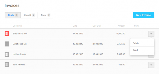
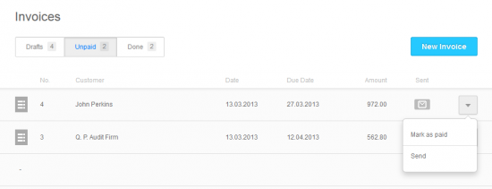
More specifically, we've given the lists and buttons a major overhaul, adding some special attention to the look and feel of your invoices overview:


The red icon on the left indicating credit notes, the new lists and buttons give you a better overview of your getting-paid flow. The new dropdowns on the right allow you to handle your invoices here and now. Simple as that.
Yes, we hear you!
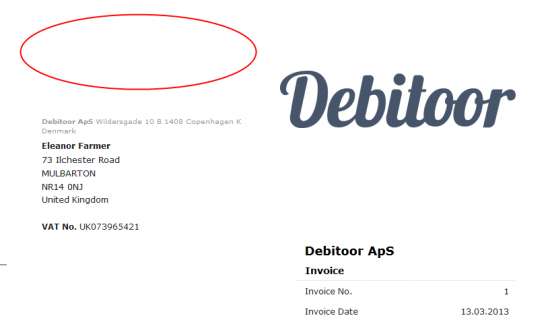
Another significant change for you - and we know this for a fact because it's been at the very top of the Debitoor user voice feature request wish list for quite some time - is the change in the heading for your invoice:

The red circle shows where the big fat 'INVOICE' used to be. Note however, that we've kept the headline in there for reminders, draft invoices and credit notes.
Make sure to check back here on the blog for new functionality and updates to be announced shortly.
