One of the keys to a successful business is having a clear overview of your accounts, don't you think?
And when everything is simple and available at a glance, it should make your work less hard, right?
So, that's how we came up with the new Debitoor home panel.

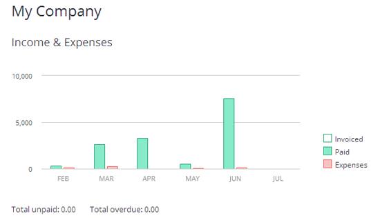
Just log in to your account, check the status of your invoices and get a comparison of the situation between different months. How does your invoicing for May compare to the month of June? What's the percentage of overdue invoices for the last month?
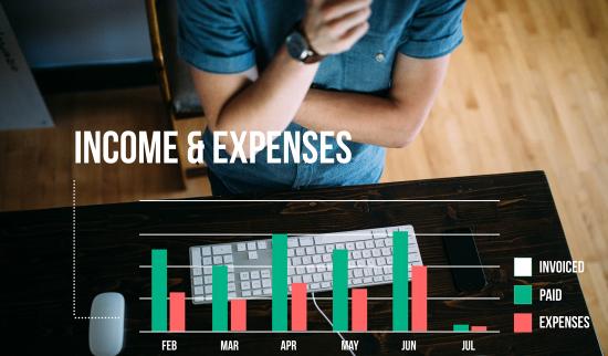
And the most important part: the overview of your income opposed to the spending. You'll know instantly if you need to cut back on some things to make more money next month.
How has your business improved over the past 6 months? Get a quick look right off when you log in.

So, how do you like the new graph? Do you think we should add something to it? How will you benefit from this?
Split test - how it works in Debitoor
A few days ago one of the users asked why he could see the graph in one of his accounts, when the other account had no graph on the dashboard.
This is to do with the thing we call "split test" - when we divide the users into two groups: one group that gets to try the new feature and the other one doesn't. After a week or so, we compare the results and see if the feedback is positive. If it is - we launch the feature to everyone, if it doesn't - we scrape it.
The group that tries th new feature doesn't get notified with it, with the intention to see the reaction to a new feature first-hand.
So far, these tests have worked well, although we've carried them out only a couple of times. If you have any questions regarding these tests send us an email.
