As you might have noticed already Debitoor has a whole new look as of today. Don't worry, it's still as intuitive and easy to use as before. And all your data is still here, just shifted around in a fresher and more organised view.
So, let's see what's different.

Welcome Screen
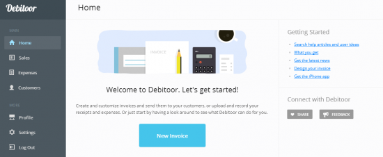
The first thing you will notice is that the control panel has moved from the top of the screen to the left-hand side. Except, if you're using Debitoor on a tablet - controls will remain on the top of the screen for mobile devices.
You will also find links to help articles, news and feedback on the right-hand side of your view.
Now it's easier to change your company details in the visible 'Profile' tab, change Debitoor presets in the 'Settings' and view your customers and expenses in corresponding tabs. Your invoices, quotes and products have moved to one single 'Sales' tab.

Sales up close
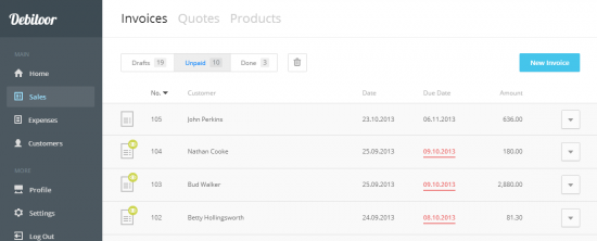
Open up the 'Sales' tab and you will find your invoices categorised under 'Drafts', 'Unpaid' and 'Done' as before. Your deleted invoices are in the 'Recycle Bin'.
To switch between 'Invoices', 'Quotes' and 'Products' use the options on top of the page:

These pages will appear in the same format as before.

Familiar layout
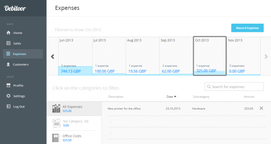
As you can see your 'Expenses' page looks the same. Although, there are a few changes in the new design it should be familiar and easy to navigate.
Just log in to your Debitoor account and see for yourself. And if you like it - let me know in the comments below. If you have some suggestions, email us at team@debitoor.com.
