This week we’re releasing a brand new look for your Debitoor mobile app. The update marks one of the most significant design changes we’ve ever done, with the aim of creating an app that is more accessible, more attractive, and more intuitive than ever.
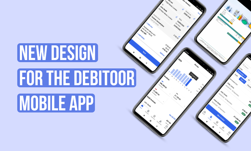
Our team of UX designers and developers have been working hard to bring this new version to light in time for autumn. The changes are part of our larger goal of creating an app designed to make invoicing & accounting simple and professional for all businesses.
To learn more about the ideas and motivations behind the changes, we spoke directly with our UX Lead and Chief Designer, Hugo Corzo, who gave us some insights into the update and more details about the new look you’ll find in the app. So let’s take a closer look at the latest in the Debitoor iPhone and Android mobile app:
Updates to the look and feel of the mobile app
The main changes you’ll see in the appearance of the mobile app itself are instantly noticeable in the:
- Home screen of your Debitoor account
- List of invoices and quotes
- Invoice creation screen
The home screen gets a reboot
In a recent update, the home screen already received a small look upgrade. But this time we’ve taken that and fully aligned it with the new look of the app. A few specifics you might notice include an increased font size for easier reading on-the-go, a clean white background, and improved spacing to better distinguish between different elements. And not to worry - none of the functions on the home page have been affected - only the design itself.
Clearer, user-friendly lists
Likely the biggest change you will notice is in your lists of invoices and quotes. These both feature an entirely new look with this update. The main changes focus on a redesign aimed at making it easier to manage your invoices and quotes from your mobile.
Invoice and quote lists have been changed to a card format, a design that provides a clearer distinction between invoices than the former list format. The change is purely visual, aimed at giving you a better experience. In addition, the search bar and filters have been updated to be easier to read and apply.
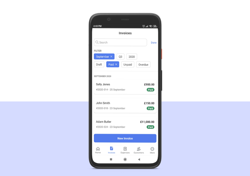
The invoice status badges have also undergone an update to match the current status badges found on the web app of your invoicing software. The badges include the label and a colour code indicating the current status of each invoice. These are brighter than the previous design, making it easier to grasp quickly which invoices might need some attention.
Finally, the traditional ‘+’ sign used to create a new invoice has been moved and made even easier to find: as a blue button near the bottom of the screen labeled ‘New Invoice’. Bigger, better, and easier to find.
A more comprehensive invoice screen
The final part of the app to be revised by our design team is the invoice creation screen. Taking inspiration from the layout of a paper invoice, the different sections in the mobile app have been divided into easily visible elements.
You’ll also notice that the screens for entering your business details, customer information, and item details have evolved: important elements are now indicated in bold and the fields are more delineated, helping make your invoicing even faster and more intuitive.
Why these changes?
Invoicing is not always a simple, straightforward process. But most business owners must create and manage invoices for their business. For this reason, the invoicing software and app that you use should be as easy and intuitive as possible. It should ensure every document you create meets the local requirements without any extra effort from you, so that you have more time and energy to spend on running your business.
For our design team, this has been the driving force behind any changes made to the app: improve the user experience through beautiful, clear, intuitive app design. According to Hugo, the changes in the mobile app design are aimed at improving the accessibility of the features in the app - making them easier to find, to see, and to use. Increasing the font size as well as contrasts improves readability, especially in a mobile environment.
The other design tweaks included in this update aim to make your invoicing experience more efficient. A crisp white background, clearer lines and distinction between elements, these changes enhance focus and allow for better concentration on a particular task.
While these changes might seem skin deep, they in fact have a strong impact on the experience of the user. Our designers have made aesthetically pleasing updates that also help to optimise your business invoicing from anywhere.