We’re excited to release a new look for Debitoor: a small change that we’re hoping will make a big impact on how you work with the software and how we can continue to grow and develop based on your feedback.
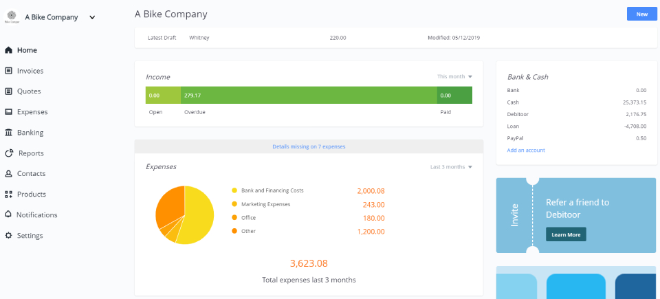
The change? We’ve moved the navigation bar from the top to the left side of the page. While this might not seem so small, it is only a design change. You’ll still find all of the features and functions of your Debitoor account available now from the left.

Why change the design?
This update is the result of our commitment to listening to our users, to growing with your needs, and to continuing to add features and tools to help your business thrive.
It’s also part of providing a modern, user-friendly interface that is built to be highly intuitive and make invoicing and accounting fast, simple, and dare-we-say fun experience from any device.
To better understand exactly why this particular design was chosen, we spoke directly with Debitoor developers and with our Head of UX, Mads Uldbæk, to gain a little insight into how and why this new design is being introduced.
Here’s what we learned about the motivating factors behind the decision to move the navigation bar:
A platform evolving
Often, the main reason for change is to make room for growth. Software is no different. As our developers work hard to build great new features, some rearranging can be required in order to make this possible.
The continued improvement of Debitoor is based not only on research but also on the daily conversations that users have with our customer support, on the responses we receive from emails - essentially: on you.
This design change allows our developers to better implement those improvements that are requested/suggested/hoped for by our users and means that Debitoor can continue to grow with your business.
A move to modernise
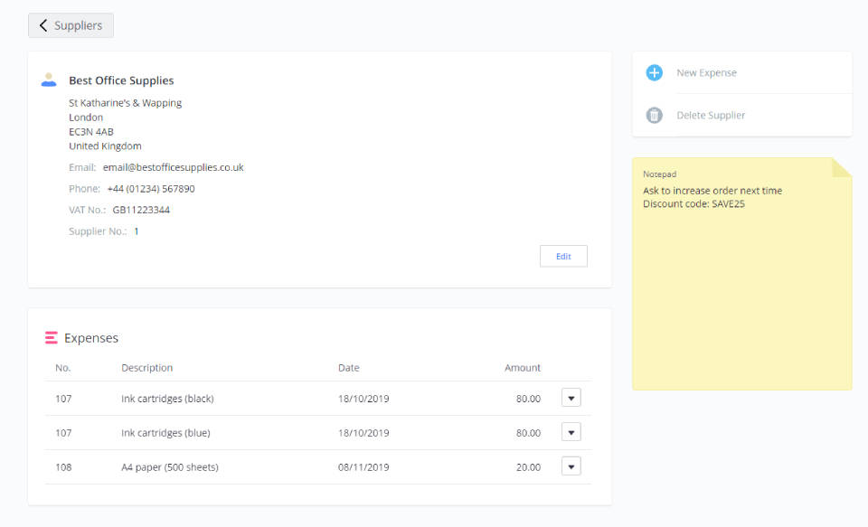
You might have noticed a few other small changes to the design in different parts of Debitoor. For example, if you’ve entered new information for a supplier recently, you’ll notice that instead of the previous window, there is now a streamlined card for adding contact details.
Recent updates to financial reports, particularly the profit & loss report, have come with a new look, all in line with the supplier tab. And... you might have missed the slight change of the background colour of your account to a subtle grey.
The move of the navigation bar is the next step in updating the design across Debitoor. Instead of introducing major changes all at once, they’ve been rolled out one by one to ensure a smoother experience for our users.
A better use of space
Finally, the placement of the navigation on the left side is a more efficient use of the screen space available on most devices. To put it simply, the majority of screens that we all use on a daily basis are wider than they are tall (of course, not including mobile apps).
The top navigation bar takes up valuable vertical space on the screen. By moving the navigation to the left, the vertical space is maximised, making better use of your screen and what you can view in your account without scrolling.
What the new design means for you
It might take a little getting used to, but we’re confident that you’ll soon see just how much more user-friendly the left-side navigation can be. The only thing that has changed is the location of the tabs for accessing the different parts of your account.
You’ll still be able to create professional, custom invoices in less than 1 minute, record expenses from anywhere, save and access customer, product and supplier details instantly, and all of the other tools you’ve enjoyed with Debitoor.
If you find that you have questions or to let us know what you think of the new navigation bar, we’re always happy to hear from you. Get in touch at team@debitoor.com or chat with us in the app.