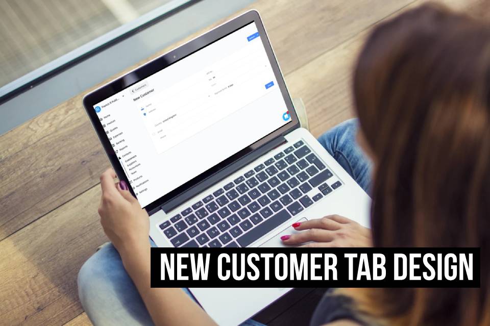
We’re starting off 2020 with a little update already. Our developers have delivered once again, adding to the Debitoor design facelift you probably noticed at the end of 2019 (if you missed this, check out our article on the new navigation bar design).

If you prefer the short version: we’re updating the design bit by bit, based on user feedback and better understanding of how you work with the software.
New customer card design
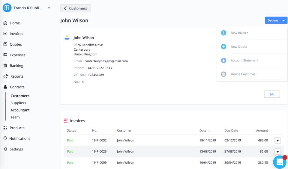
Our latest update is found under the ‘Contacts’ tab. Like the supplier details tab that we recently updated, the customer information card has also been adjusted to match the design and make for easier use.
The aim is to continue to improve the software and make it as easy to use as possible, while also updating the look to ensure you’re working with modern software. That’s one of the main perks of using online invoicing software - it’s constantly being updated behind the scenes, all without the need for you to spend time on downloads and installs.
To check out the new customer details card, log in to your account and click ‘Contacts’ > ‘Customers’. Click on any customer or click to add a new customer - there you’ll see the latest design, already active in your account.

You’ll find the customer data in your account with a cleaner, clearer design, allowing you to access the details quickly and easily.
Save notes to yourself about a particular customer, add customer-specific payment terms to be applied automatically to each new invoice you create for that customer, save multiple email addresses to one customer contact (also automatically included when sending a new invoice) and update all your customer’s details in one place.
As before, you can view and sort all invoices sent to that customer, as well as create a new invoice directly from their contact page and download a customer account statement from the ’Options’ menu at the top right of their profile.
